

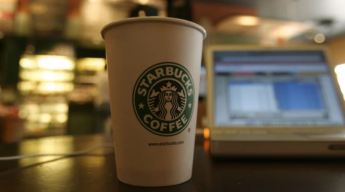
The logo of Starbucks is one of the most recognizable brand symbols in the world. Seen on coffee cups in cities across the globe, it represents far more than just a coffee company it reflects history, mythology, and the evolution of modern branding. The company Starbucks has used its iconic logo to build a strong identity that connects storytelling with everyday coffee culture.
The Origins of the Logo
The original Starbucks logo was created in 1971, when the company first opened in Seattle. The founders wanted a design that reflected the maritime history of the city, which is closely tied to the sea. They chose a siren, a mythical sea creature from ancient folklore known for luring sailors with her enchanting voice.
The first version of the logo was much more detailed than the one we see today. It featured a twin-tailed siren, inspired by 16th-century nautical woodcut illustrations. The design was meant to capture curiosity and mystery, fitting for a company selling coffee beans from around the world.

The Meaning of the Siren
The siren in the Starbucks logo symbolizes temptation, mystery, and attraction. In mythology, sirens are known for drawing people toward something irresistible. In a modern context, this connects to the idea of coffee as a daily ritual that people are naturally drawn to.
The founders believed coffee had a similar “pull”—a comforting and energizing experience that people return to again and again. The siren became a perfect visual metaphor for that idea.
Evolution of the Design
Over the years, the Starbucks logo has gone through several redesigns. Each change made it simpler and more modern while keeping the siren at the center.
- 1971: A detailed brown woodcut-style siren with full body visible
- 1987: The logo was simplified and color changed to green, symbolizing growth and freshness
- 1992: The siren was zoomed in, focusing more on her face and upper body
- 2011: The company removed the outer ring and text, leaving only the siren
The 2011 redesign marked a major shift. By removing the words “Starbucks Coffee,” the company showed confidence that the symbol alone was strong enough to represent the brand globally.
Why Green Became the Signature Color
Green is now closely associated with Starbucks, but it wasn’t always part of the original design. The switch to green in 1987 was intentional. Green represents freshness, nature, balance, and growth—all qualities linked to coffee and sustainability.
It also helps the logo stand out in urban environments filled with red, black, and white signage. The color choice plays a key role in brand recognition.
A Global Symbol of Coffee Culture
Today, the Starbucks logo is more than a brand mark—it is a cultural symbol. Whether seen in New York, Tokyo, London, or Dubai, it represents a consistent experience: coffee, comfort, and familiarity.
The simplicity of the modern design allows it to be instantly recognizable, even without text. This level of brand identity is rare and reflects decades of careful design evolution.
Misconceptions About the Logo
Over time, many myths have formed around the siren image. Some people believe it is based on a mermaid or even a specific historical figure. In reality, it is a blend of mythological inspiration and artistic interpretation rather than a direct representation of any one character.
The goal was never to tell a literal story but to create a symbol that feels timeless and slightly mysterious.
The Power of Simplicity in Branding
One of the reasons the Starbucks logo is so effective is its simplicity. Modern branding often relies on minimalism to create strong recognition. By reducing details over time, the siren became easier to identify at a glance, even from a distance.
This simplicity also makes the logo versatile—it works on cups, buildings, packaging, and digital platforms without losing impact.
Final Thought
The Starbucks logo shows how design can evolve while keeping its core meaning intact. From a detailed nautical illustration to a clean global symbol, the siren has remained at the heart of the brand.
It represents more than coffee—it reflects history, storytelling, and the emotional pull of everyday rituals.
And that is why, even without words, the green siren is instantly understood around the world.


