

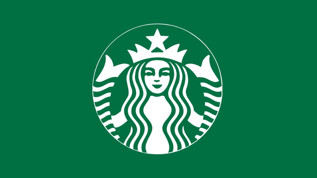
The Starbucks logo is among the most recognizable emblems globally, symbolizing not just a coffee brand but a cultural phenomenon. However, beneath its ubiquitous presence lies a subtle design element that many overlook—a deliberate imperfection that adds depth and relatability to the logo.
Evolution of the Starbucks Logo
Established in 1971, Starbucks’ original logo featured a brown, twin-tailed mermaid, or Siren, inspired by nautical themes and Herman Melville’s Moby-Dick. This design reflected the company’s maritime roots and its founders’ appreciation for seafaring lore. Over the decades, the logo underwent several transformations:
- 1987: The color scheme shifted from brown to green, symbolizing growth, freshness, and prosperity. The Siren’s image was refined, with her hair covering her bare chest to align with contemporary sensibilities.
EN.WIKIPEDIA.ORG - 1992: Further modifications cropped the Siren’s image, focusing more on her face and reducing the visibility of her twin tails. This change aimed to modernize the logo as Starbucks expanded its global presence.
EN.WIKIPEDIA.ORG - 2011: The most significant redesign removed the wordmark “Starbucks Coffee,” leaving the Siren as the sole focal point. This minimalist approach underscored the brand’s confidence in its visual identity’s strength and its diversification beyond coffee products.
The Siren’s Symbolism
The choice of a Siren—a mythological creature known for luring sailors with her enchanting voice—serves as a metaphor for Starbucks’ intent to captivate customers with its offerings. The Siren embodies allure, mystery, and the irresistible pull of a freshly brewed cup of coffee. As Starbucks diversified its products and markets, the Siren evolved to represent not just coffee but the brand’s broader appeal and aspirations.
The Deliberate Imperfection
In the 2011 redesign, the creative team at Lippincott sought to humanize the Siren, making her more approachable and relatable. An initial perfectly symmetrical design rendered her unnervingly flawless, creating a sense of artificiality. To counter this, designers introduced a subtle asymmetry to her face:
Facial Asymmetry: A closer examination reveals that the right side of the Siren’s face has a slight shadow, and her nose dips marginally lower on that side. This intentional imperfection breaks the monotony of symmetry, adding character and warmth to her visage. This nuanced detail exemplifies the design principle that imperfection can enhance relatability. By incorporating asymmetry, the logo transcends sterile perfection, resonating more deeply with consumers on a human level.
Psychological Impact of Asymmetry in Design
Human brains are wired to recognize patterns and seek symmetry, often associating it with beauty and perfection. However, slight asymmetries can introduce intrigue and authenticity, making designs feel more organic and approachable. In the case of the Starbucks logo, the subtle imperfection:
- Enhances Memorability: The unique feature sets the logo apart from other symmetrical designs, making it more distinctive and easier to recall.
- Invokes Warmth: The asymmetry adds a touch of humanity, fostering a sense of warmth and connection with the audience.
- Reflects Brand Identity: It mirrors Starbucks’ brand ethos of embracing individuality and imperfection, aligning with the company’s commitment to personalized customer experiences.
The Siren’s Role Beyond Coffee
The 2011 logo redesign, which eliminated the “Starbucks Coffee” text, signified the company’s evolution into a multifaceted brand offering a range of products beyond coffee. The standalone Siren encapsulates this broader identity, symbolizing:
- Versatility: The Siren’s timeless and adaptable image allows Starbucks to venture into various markets, from teas and pastries to merchandise and music.
- Global Appeal: Her mythical origins and abstract design transcend cultural boundaries, making the logo universally recognizable and relatable.
- Emotional Connection: The Siren fosters an emotional bond with consumers, embodying the brand’s narrative and values without the need for textual explanation.
The Starbucks logo exemplifies how thoughtful design elements can profoundly influence brand perception. The deliberate asymmetry in the Siren’s face adds a layer of humanity and approachability, transforming a simple image into a powerful symbol of connection. This subtle imperfection not only enhances the logo’s aesthetic appeal but also reinforces Starbucks’ identity as a brand that values authenticity and individuality.
Next time you enjoy your Starbucks beverage, take a moment to appreciate the nuanced artistry of the Siren—a testament to the beauty of imperfection in design.
")


")


