
The iconic red and yellow McDonald’s logo is more than just a recognizable symbol; it’s a strategic design rooted in psychology and marketing. These colors were deliberately chosen to evoke specific emotions and behaviors in consumers, contributing significantly to the brand’s global success.
The Origins of the Golden Arches
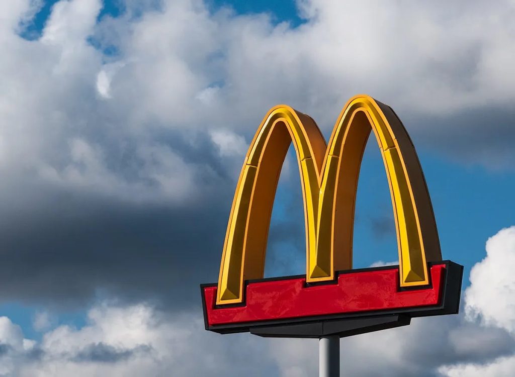
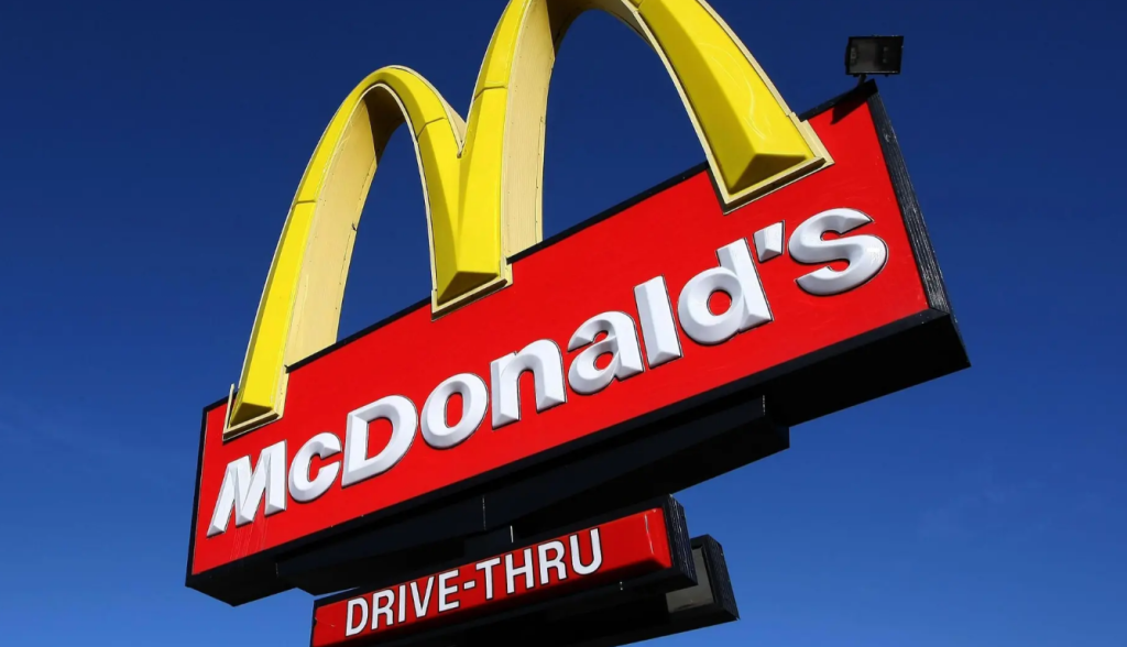
The McDonald’s logo, featuring the distinctive golden arches, has evolved since its inception. In the early 1960s, architect Stanley Clark Meston incorporated two large golden arches into the design of McDonald’s restaurants, which eventually formed the basis of the ‘M’ in the logo. This design became a central element of the brand’s identity, symbolizing fast, friendly service and becoming one of the most recognized logos worldwide.
The Psychology Behind Red and Yellow
The choice of red and yellow in McDonald’s branding is deeply rooted in color psychology. Red is known to stimulate appetite and increase heart rate, creating a sense of urgency and excitement. Yellow, on the other hand, is associated with happiness and friendliness and is highly visible, especially in daylight. The combination of these colors is designed to grab attention quickly, evoke positive feelings, and encourage quick decision-making, making it ideal for a fast-food environment.
Global Influence and Adaptation
McDonald’s color scheme has influenced numerous other fast-food chains, such as Burger King and In-N-Out Burger, which also utilize red and yellow in their branding to attract customers. However, McDonald’s has also adapted its color usage in certain regions to align with local aesthetics and values. For instance, in Sedona, Arizona, the arches are turquoise to blend with the natural surroundings, demonstrating the brand’s flexibility and sensitivity to local cultures.
Evolving Towards Sustainability
In recent years, McDonald’s has begun incorporating green into its branding, particularly in Europe, to signify a commitment to environmental sustainability. Green is associated with nature and health, aiming to reshape the brand’s image as more eco-friendly and socially responsible. This shift reflects changing consumer values and McDonald’s efforts to remain relevant in a health-conscious market.
A Closer Look at Consumer Psychology
The effectiveness of McDonald’s red and yellow branding lies not just in color theory, but in its practical influence on human behavior. When people are hungry and in a hurry, they tend to make impulsive choices. The vibrant red and yellow hues subtly trigger those impulses, making individuals more likely to stop in for a quick meal. Red, in particular, is associated with energy and urgency, prompting faster decision-making — ideal for fast food. Yellow, meanwhile, communicates cheerfulness and optimism, creating a welcoming environment even before stepping inside.
A Branding Blueprint for Success
McDonald’s use of color has served as a blueprint for countless businesses aiming to establish strong visual identities. The company’s global recognition owes much to the consistency of its branding. Whether in Times Square or Tokyo, the golden arches convey the same promise of quick service and familiar food. The success of this color strategy proves how powerful branding can be when it taps into subconscious emotional triggers.
Conclusion
The red and yellow colors of the McDonald’s logo are not arbitrary choices but strategic decisions based on psychological principles aimed at influencing consumer behavior. By understanding and leveraging the emotional responses elicited by these colors, McDonald’s has created a powerful and enduring brand identity. As the company continues to evolve, its use of color remains a central element in connecting with customers and adapting to new market trends.


")


