

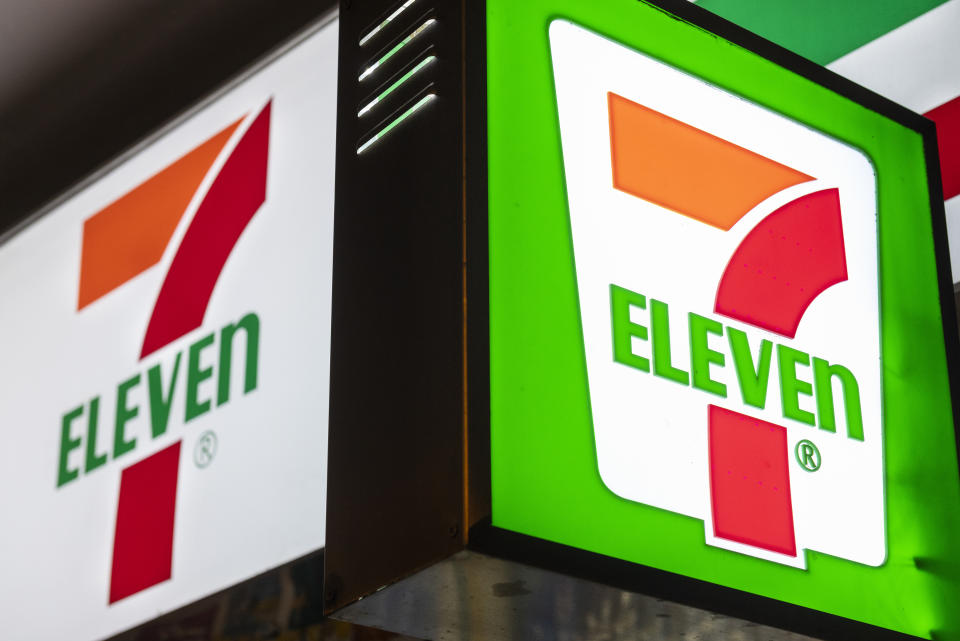
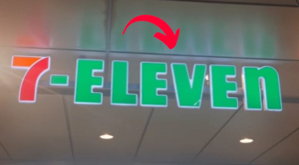
In April 2024, a seemingly simple Instagram video by user @twosometravellers turned into a viral sensation when it pointed out a peculiar design choice in the iconic 7-Eleven logo. The clip, which quickly gained over 150,000 views, focused on a subtle and widely overlooked detail: the word “ELEVEn” ends with a lowercase ‘n’, even though the rest of the word is in uppercase letters. The discovery left social media users shocked and confused. Many viewers admitted they had never noticed the discrepancy before, despite the logo being prominently displayed on stores around the world. The unexpected revelation quickly spread to TikTok, Reddit, and other platforms, with thousands joining the conversation and speculating on the reasoning behind the design.
The Origin of the Lowercase ‘n’
As it turns out, the unusual logo choice dates back to 1968. The story behind it is both simple and charming. According to the company, the wife of Joe C. Thompson Jr.—then-president of 7-Eleven—suggested changing the final letter in “ELEVEN” to lowercase to make the logo appear “softer and more friendly.” She felt that the all-uppercase version looked harsh and too rigid for the brand’s welcoming image. The company took her advice seriously and redesigned the logo to incorporate a lowercase ‘n’. Since then, it has remained part of the official branding. Over five decades later, the lowercase letter still causes double takes and prompts questions among those encountering it for the first time.
A Lesson in Typography and Branding
Designers and branding experts have since offered their own interpretations of the lowercase ‘n’. Many agree that the subtle break in convention adds visual interest and makes the logo stand out in a crowded marketplace. In an industry where countless logos can start to look alike, small deviations can help a brand remain memorable. The lowercase ‘n’ is also seen as a brilliant example of the power of detail in visual communication. While consumers may not consciously notice the unique element, it can create a subtle emotional effect—something softer, more approachable, and less mechanical. Some experts argue that this kind of visual disruption is a clever psychological trick that keeps the viewer’s attention on the logo a bit longer, increasing brand recall.
Public Reactions: Shock and Admiration
Once the design quirk went viral, social media exploded with reactions. Users expressed a mix of surprise, amusement, and appreciation. Comments like “How did I never notice this?” and “I feel like my whole life has been a lie” flooded posts across platforms. Others praised the simplicity and brilliance of the design, calling it a testament to how good branding doesn’t need to shout to be effective. A few even joked that the lowercase ‘n’ was the “Easter egg” of the retail world—hidden in plain sight for decades.
Conclusion: Small Detail, Big Impact
What started as a casual social media observation turned into a viral design revelation. The lowercase ‘n’ in the 7-Eleven logo isn’t just a typographic oddity—it’s a reminder of how small, intentional design choices can have a lasting impact. More than just a logo, it’s a story about how thoughtful branding, attention to detail, and even a suggestion from a company president’s spouse can shape a global visual identity. So the next time you walk past a 7-Eleven, take a closer look—you might just appreciate it a little more.


